Session 2: ggplot2
ggplot2
The “gg” in ggplot2 stands for the “Grammar of Graphics.” The grammar of graphics is a philosophy of data visualization which forces you to think about what you want to visualize how. Hadley Wickham followed this philosophy to implement the ggplot2 package.
The anatomy of a ggplot2 plot
The grammar of graphics specifies building blocks out of which an analyst builds a plot. These include, in the order of application:
- Data (what do you want to plot?)
- Aesthetic mapping (what comes on the x and y axes? )
- Geometric object (
geoms) (How do we want to see our data? Points, lines, bars, …) - Add more
geoms(e.g. add regression lines to a scatterplot) - Polish labels, scales, legends, and appearance.
(see this link for more details)
class: inverse background-image: url(“Ninja-header.svg_opacity1.png”) background-size: contain
Useful tips from the dataviz ninja
- Think hard about what you want to visualize!
“Think of graphs as comparison” - Andrew Gelman
ggplot2 building blocks
Let’s look at the ggplot2 building blocks in practice:
library(gapminder) # loads the gapminder data
library(tidyverse) # loads ggplot2 and other packages

example_plot <- ggplot(data = gapminder, # specify which dataset to use
                       aes(x = year, # what goes on the x axis?
                           y = lifeExp )) + # what's on the y axis?
  geom_point() # with which geometric object should the data be displayed?
Note the + that ties the building blocks together.
ggplot2 building blocks
print(example_plot)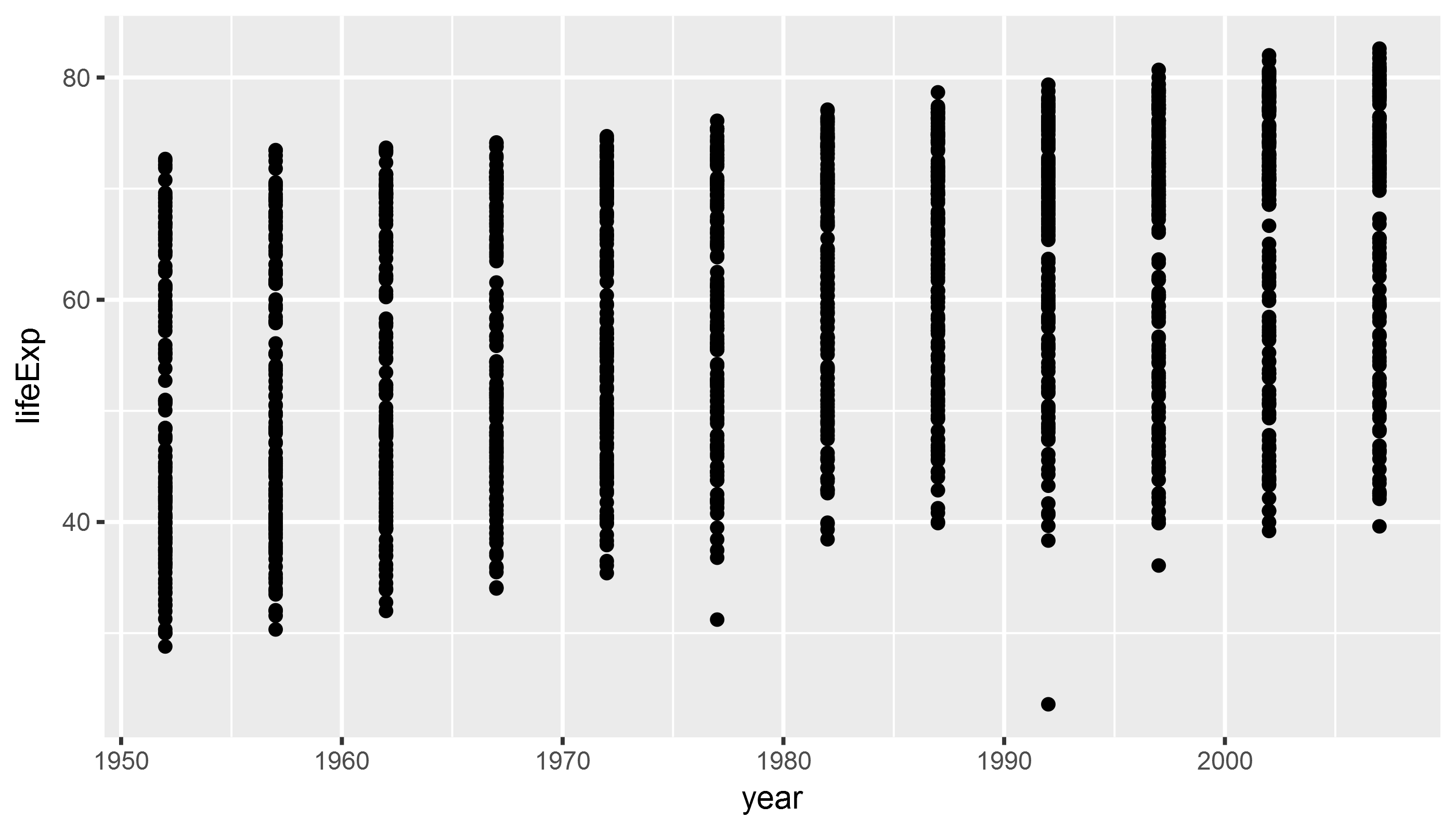
Aesthetics - Size
library(gapminder)
library(tidyverse)

example_plot <- ggplot(data = gapminder,
                       aes(x = year,  # the aes() function defines aesthetics
                           y = lifeExp,
                           size = gdpPercap)) + # map the aesthetic 'size' to gdp/pc
  geom_point()

# print(example_plot)
Aesthetics - Size
print(example_plot)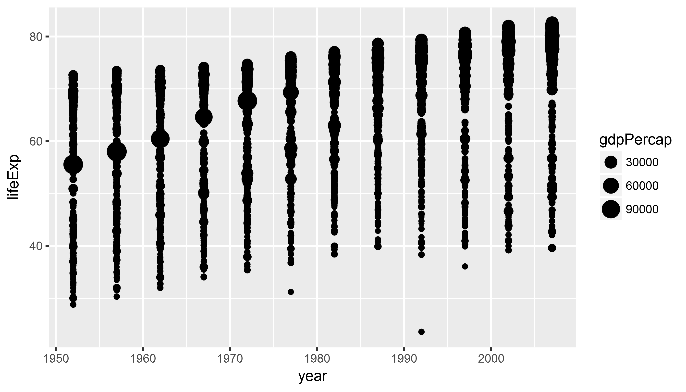
Aesthetics II - Color
library(gapminder)
library(tidyverse)

example_plot <- ggplot(data = gapminder,
                       # the aes() function defines aesthetics
                       aes(x = year,  # x axis
                           y = lifeExp, # y axis
                           color = continent, # map color to continent
                           size = gdpPercap)) + # map the aesthetic 'size' to gdp/pc
  geom_point()
Aesthetics II - Color
print(example_plot)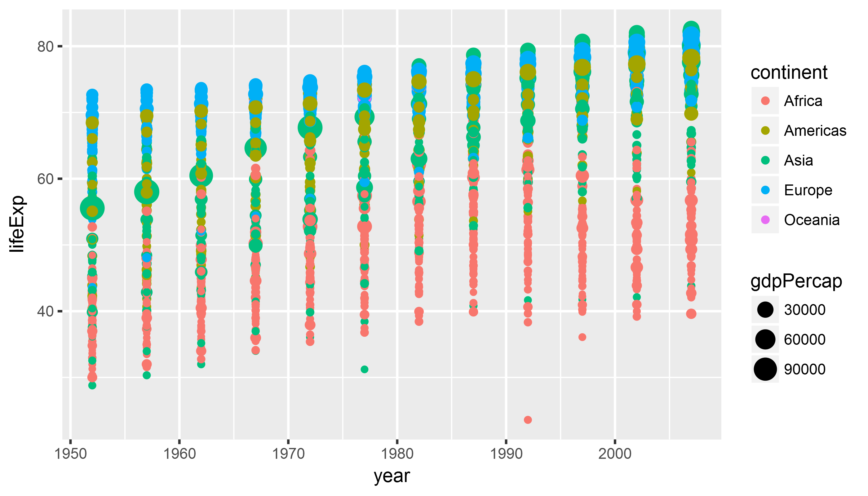
class: inverse background-image: url(“Ninja-header.svg_opacity1.png”) background-size: contain
Useful tips from the dataviz ninja
Think hard about what you want to visualize!
Don’t use too many aesthetics - just use those that help you clarify your comparison! > “When ggplot successfully makes a plot but the result looks insane, the reason is almost always that something has gone wrong in the mapping between the data and aesthetics for the geom being used” - Kieran Healy
geoms
library(gapminder)
library(tidyverse)

example_plot <- ggplot(data = gapminder,
                       aes(x = year,
                           y = lifeExp)) +
  geom_line() # lines instead of points
geoms
Whoops! What happened here?
print(example_plot)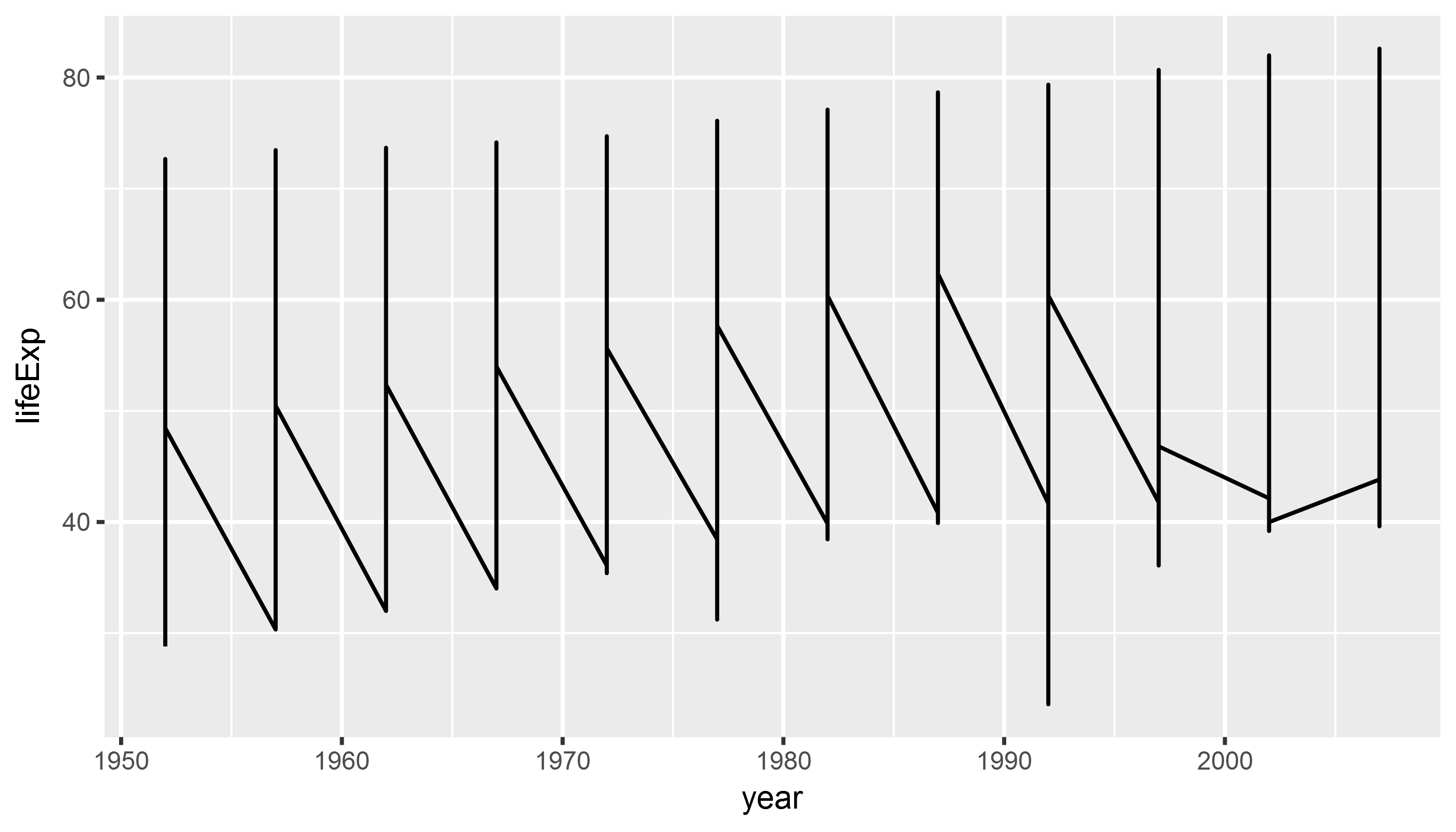
geoms
library(gapminder)
library(tidyverse)

example_plot <- ggplot(data = gapminder,
                       aes(x = year,
                           y = lifeExp,
                           group = country)) +  # tell ggplot2 which
                                                # observations belong together
  geom_line()
geoms
print(example_plot)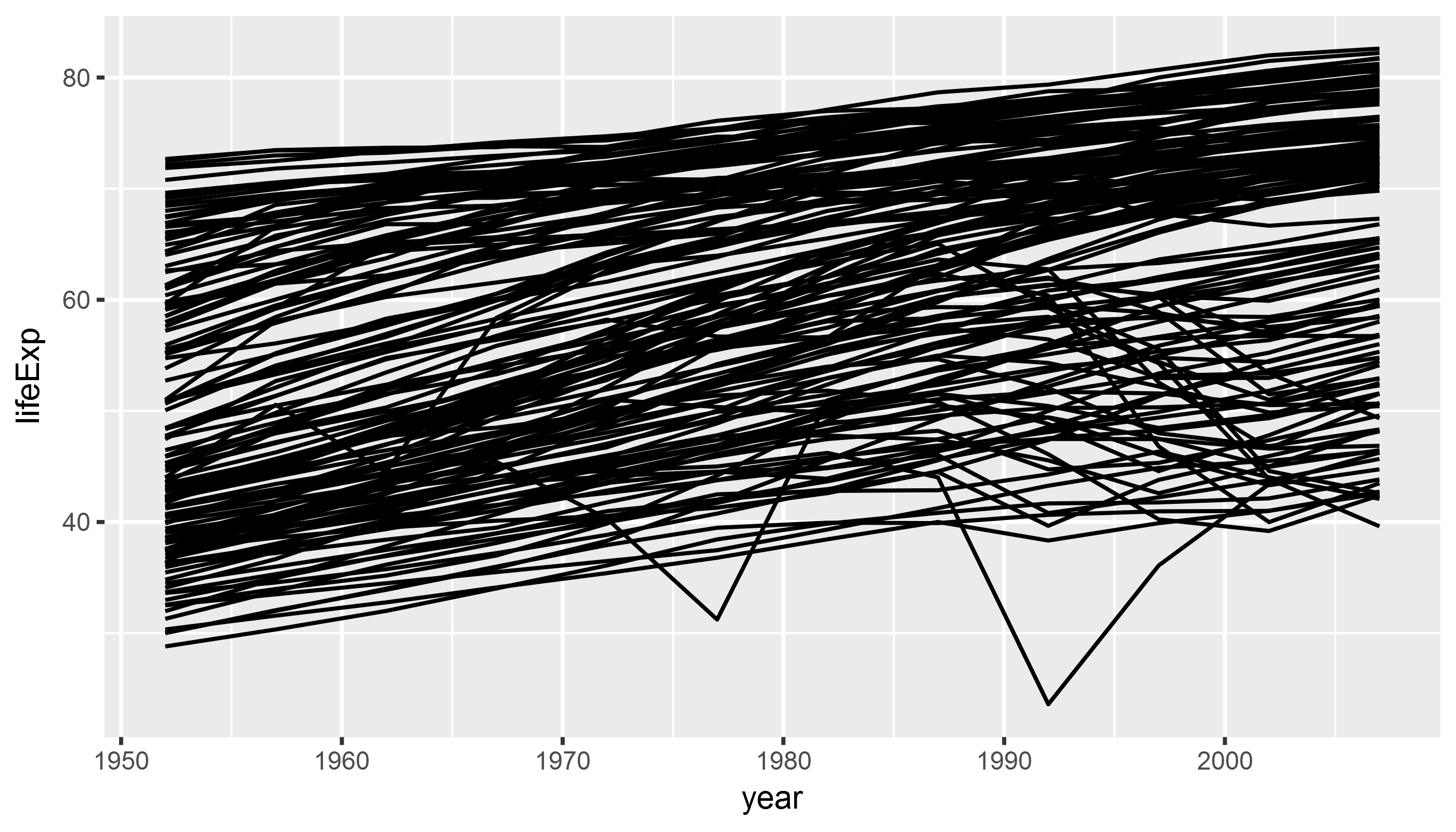
Combining geoms
library(gapminder)
library(tidyverse)

example_plot <- ggplot(data = gapminder,
                       aes(x = year,
                           y = lifeExp)) +
  geom_point() +
  geom_smooth(method = "lm") # add regression line
Combining geoms
print(example_plot)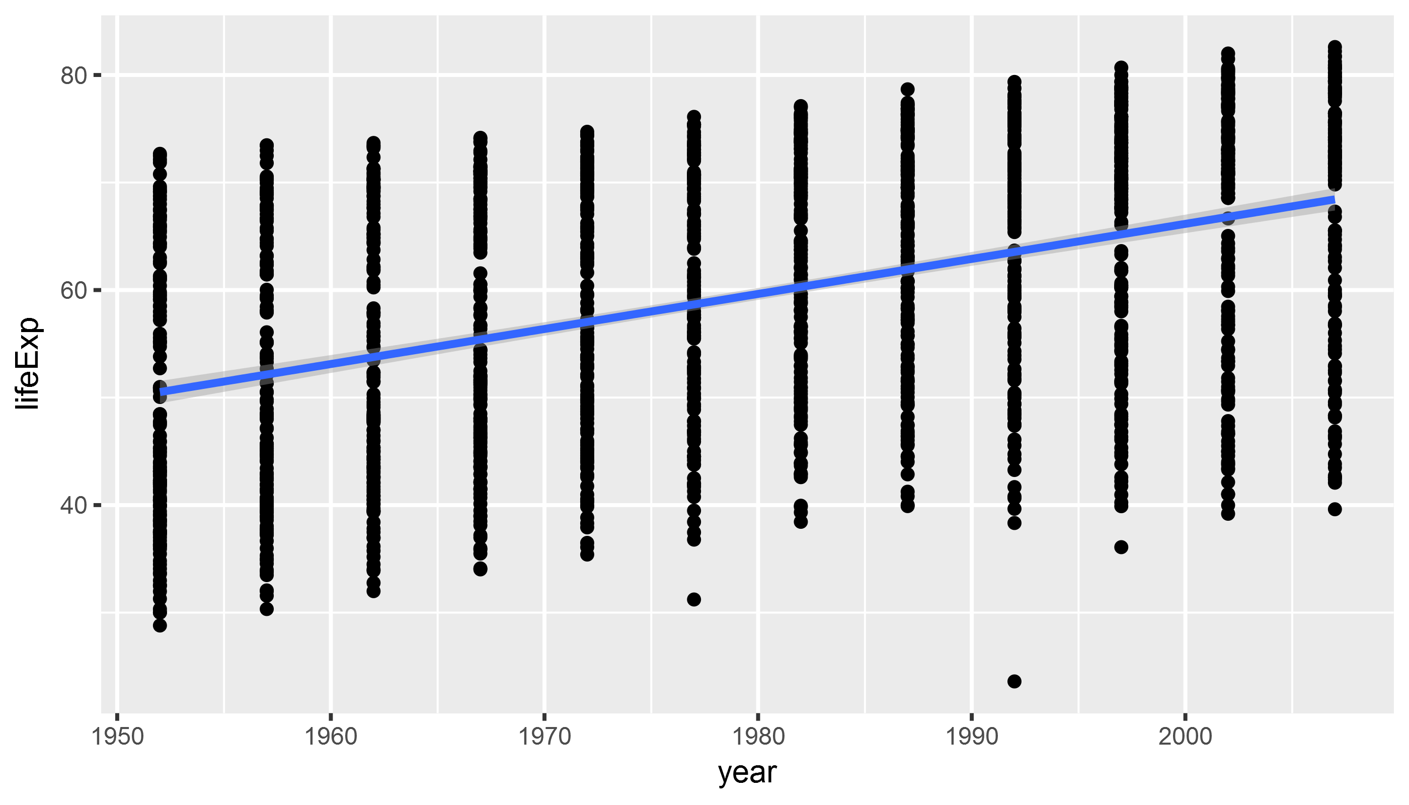
Combining geoms II
library(gapminder)
library(tidyverse)

example_plot <- ggplot(data = gapminder,
                       aes(x = year,
                           y = lifeExp)) +
  geom_point() +
  geom_smooth(method = "lm") +
  geom_smooth(method = "loess",
              color = "firebrick") # fix smoother color
Bonus question: in this example we fix the color, i.e. we map it to a fixed value (firebrick which is red). What happens if we would map color to a variable in the gapminder dataset, such as continent?
Combining geoms II
print(example_plot)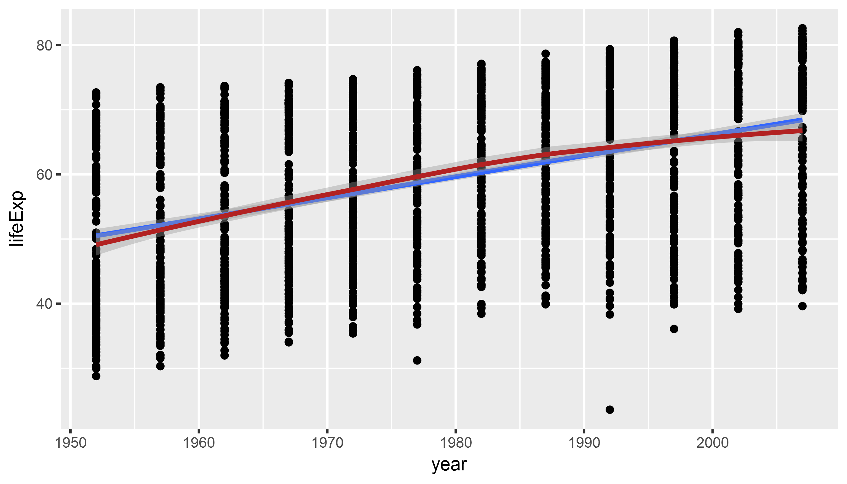
Manipulate and Preprocess Data
Subsetting/filtering data helps to reduce complexity & get at the comparison that we want. To do that, we use the dplyr package which is part of the tidyverse.
To filter data, we use the filter() function.
library(tidyverse) # loads dplyr package, among others
library(gapminder)

gapminder_americas <- gapminder %>% # the %>% `chains` together functions
  filter(continent == "Americas") # that's two "="

head(gapminder_americas, 5)
## # A tibble: 5 x 6
## country continent year lifeExp pop gdpPercap
## <fctr> <fctr> <int> <dbl> <int> <dbl>
## 1 Argentina Americas 1952 62.5 17876956 5911
## 2 Argentina Americas 1957 64.4 19610538 6857
## 3 Argentina Americas 1962 65.1 21283783 7133
## 4 Argentina Americas 1967 65.6 22934225 8053
## 5 Argentina Americas 1972 67.1 24779799 9443Manipulate and Preprocess Data
Modify/add variables to existing data frame. We modify data with the mutate() function and chain them together using the pipe operator %>%.
library(tidyverse) # loads dplyr package, among others
library(gapminder)

gapminder_americas <- gapminder %>%
  filter(continent == "Americas") %>%
  # create a character/categorical variable
  # to distinguish between North/South America
  mutate(north_america = ifelse(country == "United States" |
                                  country == "Canada",
                                "north_america",
                                "south_america"))
head(gapminder_americas,3)
## # A tibble: 3 x 7
## country continent year lifeExp pop gdpPercap north_america
## <fctr> <fctr> <int> <dbl> <int> <dbl> <chr>
## 1 Argentina Americas 1952 62.5 17876956 5911 south_america
## 2 Argentina Americas 1957 64.4 19610538 6857 south_america
## 3 Argentina Americas 1962 65.1 21283783 7133 south_americaManipulate and Preprocess Data
Use filtered and preprocessed data to highlight comparisons in ggplot:
ggplot(gapminder_americas, # only use data for Americas
       aes(x = year,
           y = gdpPercap,
           color = north_america)) + # map "north_america" category to color
  geom_point()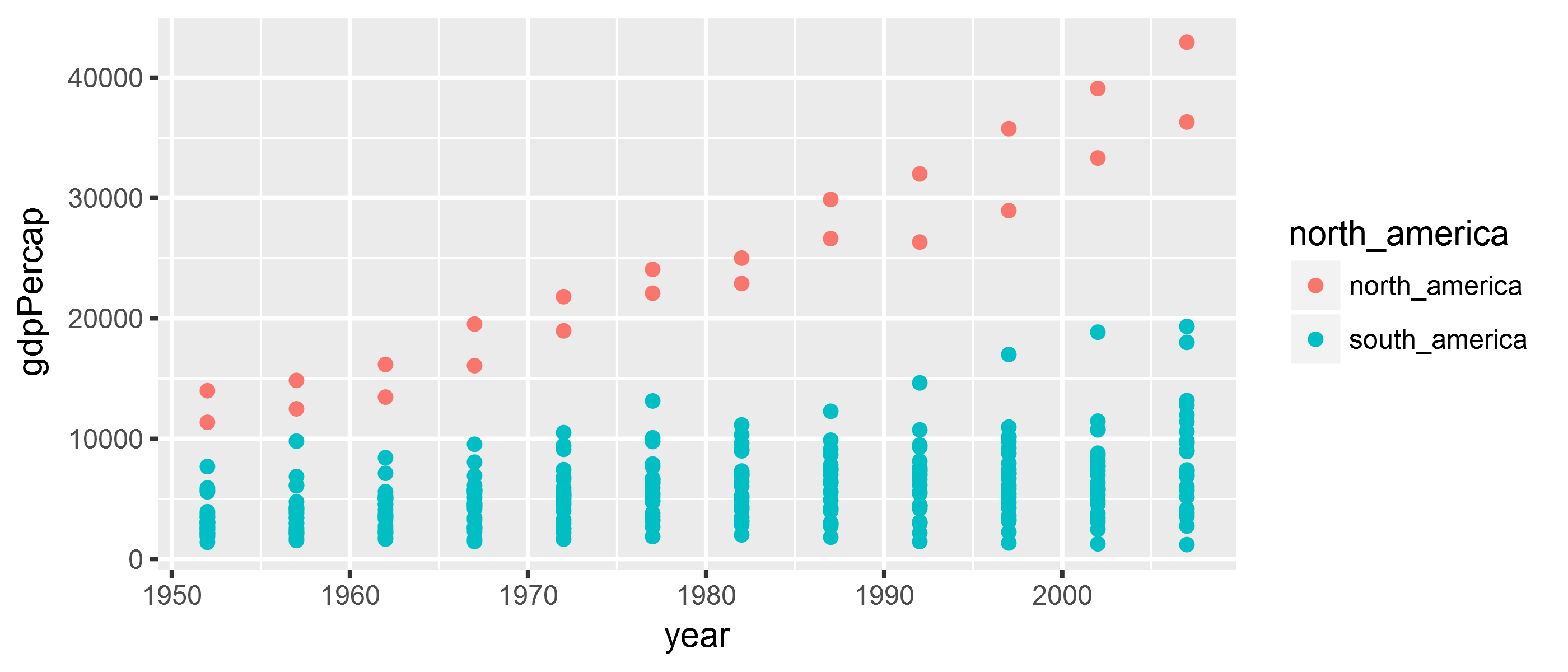
Exercise
Plot the development of population size (pop variable in the gapminder data) over time (year variable in the gapminder data) in Asia (hint: continent == "Asia"). Add a trend line and/or smooth line.
Bonus exercise: Plot the relationship between population size pop and gdpPercap! (hint: might make sense to wrap pop and gdpPercap in log()).
Solution
library(tidyverse)
library(gapminder)

gapminder_asia <- gapminder %>%
  filter(continent == "Asia")

asia_pop <- ggplot(gapminder_asia,
                   aes(x = year, y = pop)) +
  geom_point() +
  geom_smooth(method = "lm")

print(asia_pop)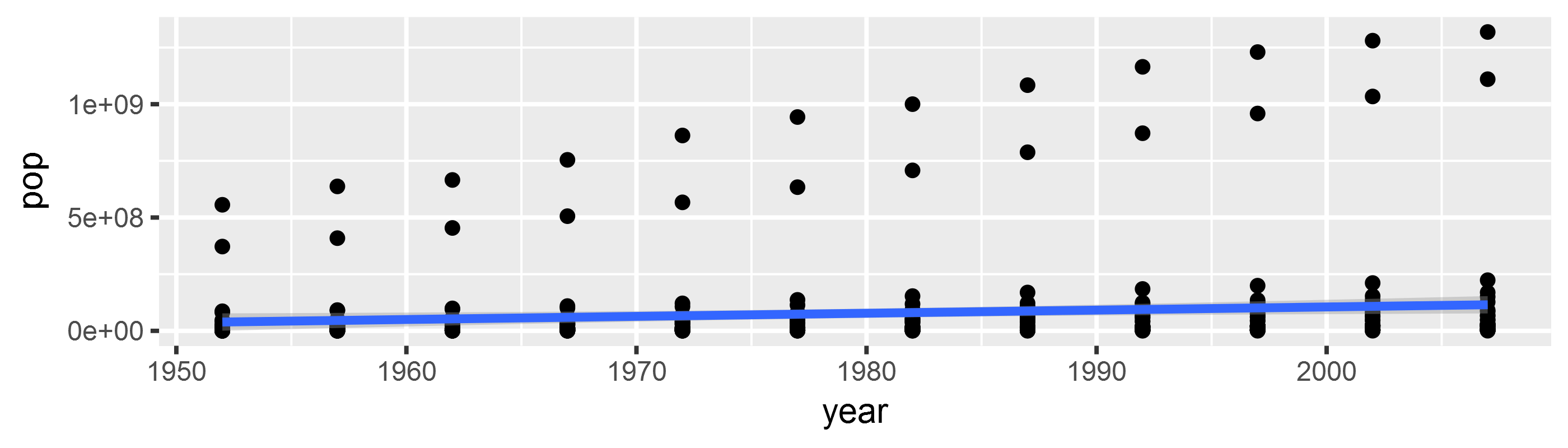
Walkthrough Exercise
Goal:
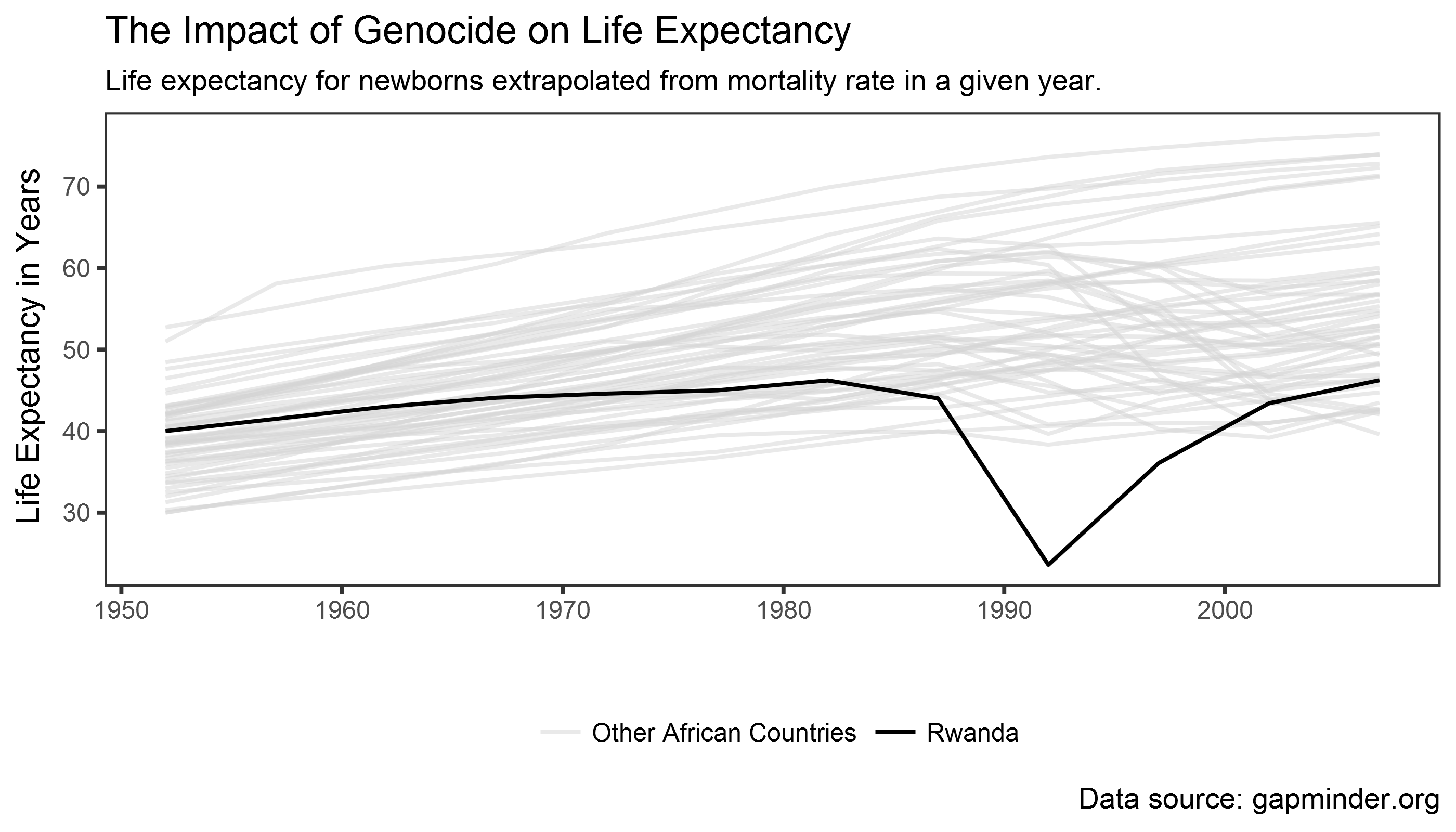
What do we want to visualize?
Think about the data! What is the comparison?
Genocide vs. non-genocide countries => Rwanda vs. rest of Africa
library(gapminder)
library(tidyverse)

gapminder_africa <- gapminder %>%
  # filter only African countries
  filter(continent == "Africa") %>%
  # create a categorical variable that distinguishes
  # between Rwanda and other African countries
  mutate(color_plot = ifelse(country != "Rwanda", # != = "!" + "="
                             "Other African Countries",
                             "Rwanda"))
Add geom_line() + map color/alpha
rwanda_plot <- ggplot(gapminder_africa,
                      aes(x = year,
                          y = lifeExp,
                          group = country,
                          color = color_plot)) +
  geom_line(aes(alpha = color_plot)) # map alpha to "color_plot" variable
                                     # ggplot chooses alpha level automatically


print(rwanda_plot)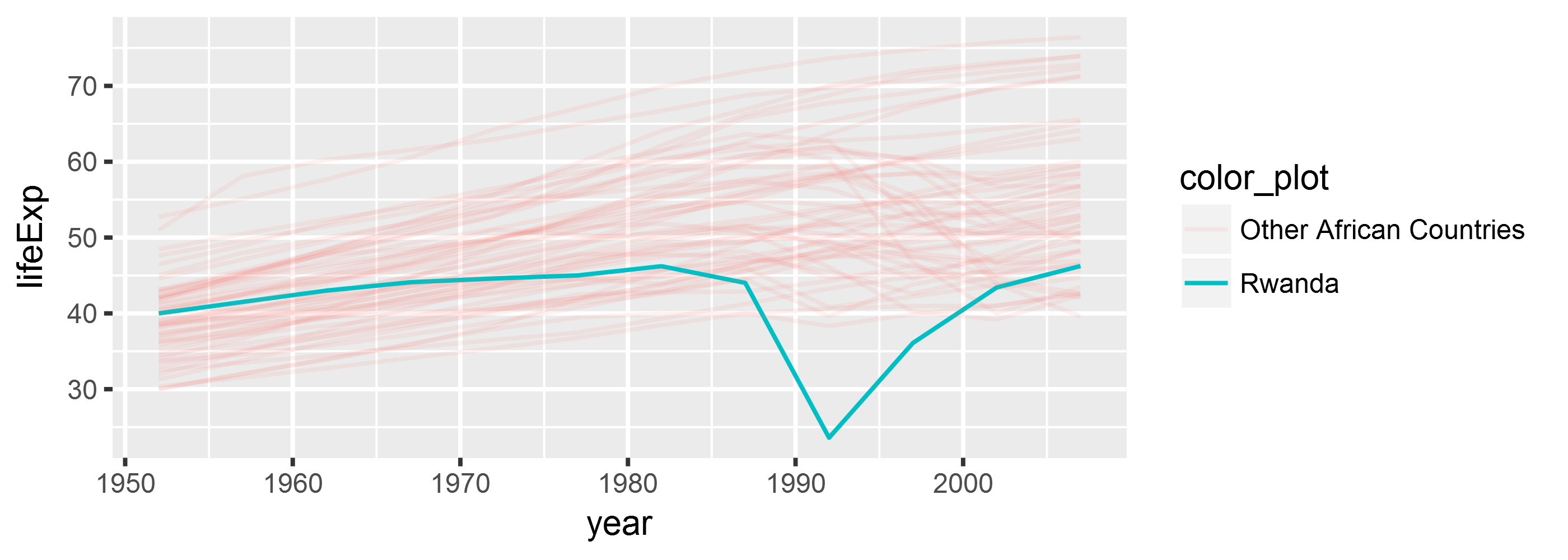
Add color/alpha scales
rwanda_plot <- ggplot(gapminder_africa,
                      aes(x = year,
                          y = lifeExp,
                          group = country,
                          color = color_plot)) +
  geom_line(aes(alpha = color_plot)) +

  # we assign colors/alpha values/other "aes" through "scale" functions
  scale_alpha_discrete("", range = c(0.5, 1)) +
  scale_color_manual("", values = c("lightgrey", "black"))


print(rwanda_plot)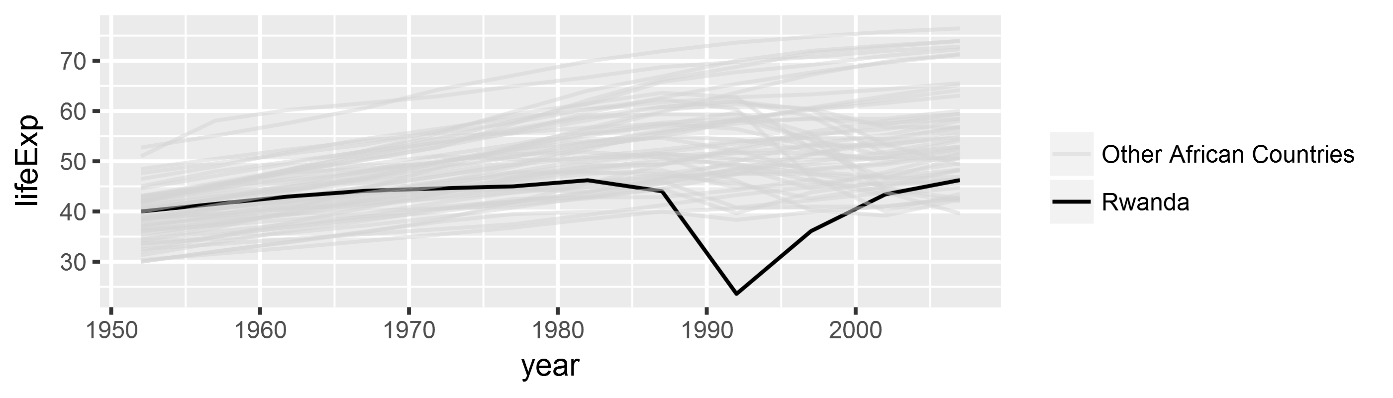
Manipulate appearance: add theme
rwanda_plot <- ggplot(gapminder_africa,
                      aes(x = year,
                          y = lifeExp,
                          group = country,
                          color = color_plot)) +
  geom_line(aes(alpha = color_plot)) +
  scale_alpha_discrete("", range = c(0.5, 1)) +
  scale_color_manual("", values = c("lightgrey", "black")) +

  # add theme
  theme_bw() + # black and white theme
  theme(legend.position = "bottom", # legend position
        panel.grid = element_blank()) # remove grid lines
Manipulate appearance: add theme
print(rwanda_plot)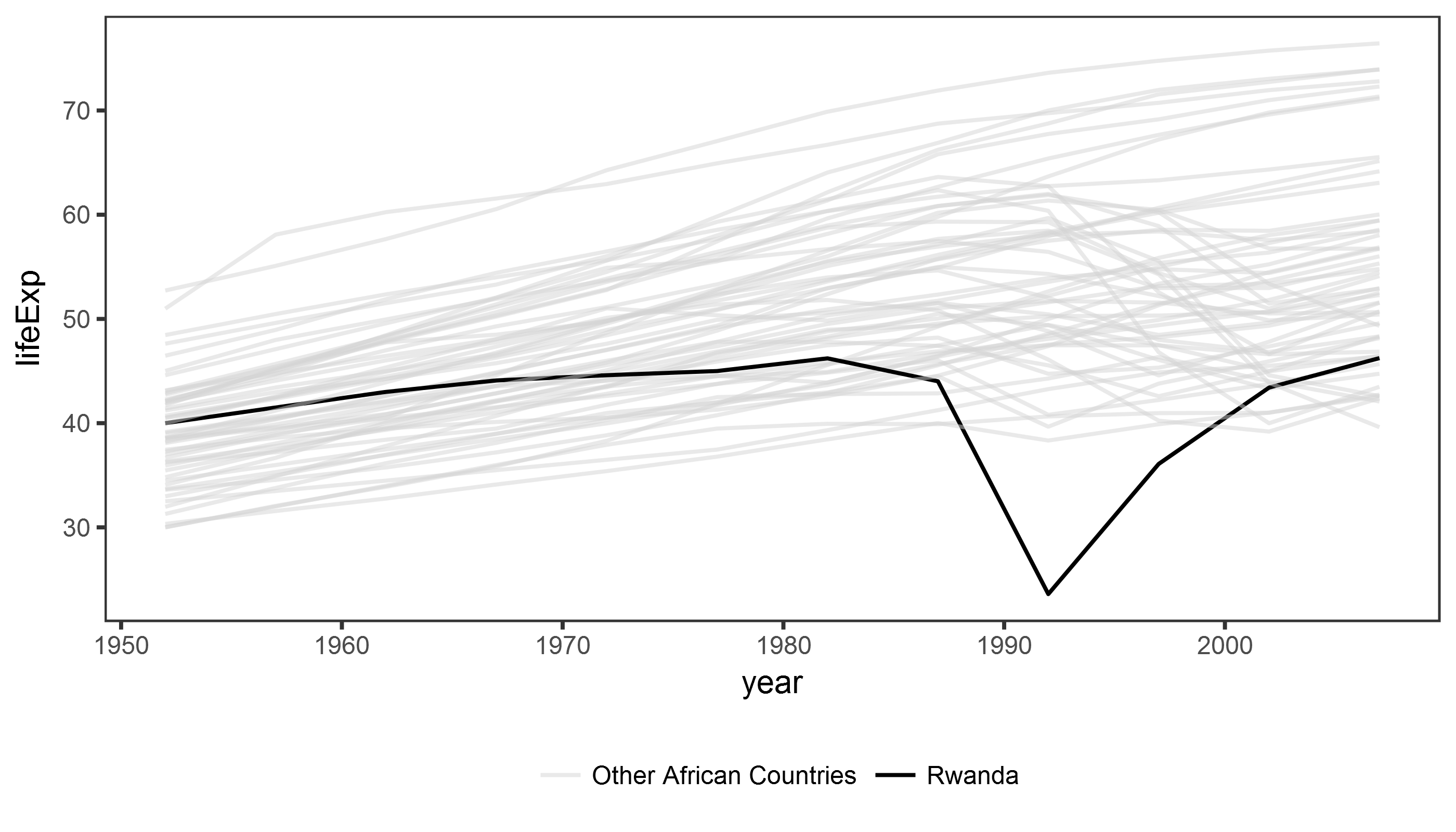
Manipulate appearance: change labels
rwanda_plot <- ggplot(gapminder_africa,
                      aes(x = year,
                          y = lifeExp,
                          group = country,
                          color = color_plot)) +
  geom_line(aes(alpha = color_plot)) +
  scale_alpha_discrete("", range = c(0.5, 1)) +
  scale_color_manual("", values = c("lightgrey", "black")) +
  theme_bw() +
  theme(legend.position = "bottom",
        panel.grid = element_blank()) +

  # labels, captions, and title/subtitle
  labs(x = "", y = "Life Expectancy in Years",
       title = "The Impact of Genocide on Life Expectancy",
       subtitle = "Life expectancy for newborns extrapolated from mortality rate in a given year.",
       caption = " Data source: gapminder.org")
Manipulate appearance: change labels
print(rwanda_plot)
class: inverse background-image: url(“Ninja-header.svg_opacity1.png”) background-size: contain
Useful tips from the dataviz ninja
Think hard about what you want to visualize!
Don’t use too many aesthetics - just use those that help you clarify your comparison!
Trial and error is your friend!
> “If you are unsure of what each piece of code does, take advantage of ggplot’s additive character. Working backwards from the bottom up, remove each + some_function(…) statement one at a time to see how the plot changes.” - Kieran Healy