Session 2: ggplot2
ggplot2
The “gg” in ggplot2 stands for the “Grammar of Graphics.” The grammar of graphics is a philosophy of data visualization which forces you to think about what you want to visualize how. Hadley Wickham followed this philosophy to implement the ggplot2 package.
The anatomy of a ggplot2 plot
The grammar of graphics specifies building blocks out of which an analyst builds a plot. These include, in the order of application:
- Data (what do you want to plot?)
- Aesthetic mapping (what comes on the x and y axes? )
- Geometric object (
geoms) (How do we want to see our data? Points, lines, bars, …) - Add more
geoms(e.g. add regression lines to a scatterplot) - Polish labels, scales, legends, and appearance.
(see this link for more details)
class: inverse background-image: url(“Ninja-header.svg_opacity1.png”) background-size: contain
Useful tips from the dataviz ninja
- Think hard about what you want to visualize!
“Think of graphs as comparison” - Andrew Gelman
ggplot2 building blocks
Let’s look at the ggplot2 building blocks in practice:
library(gapminder) # loads the gapminder data
library(tidyverse) # loads ggplot2 and other packages

example_plot <- ggplot(data = gapminder, # specify which dataset to use
                       aes(x = year, # what goes on the x axis?
                           y = lifeExp )) + # what's on the y axis?
  geom_point() # with which geometric object should the data be displayed?
Note the + that ties the building blocks together.
ggplot2 building blocks
print(example_plot)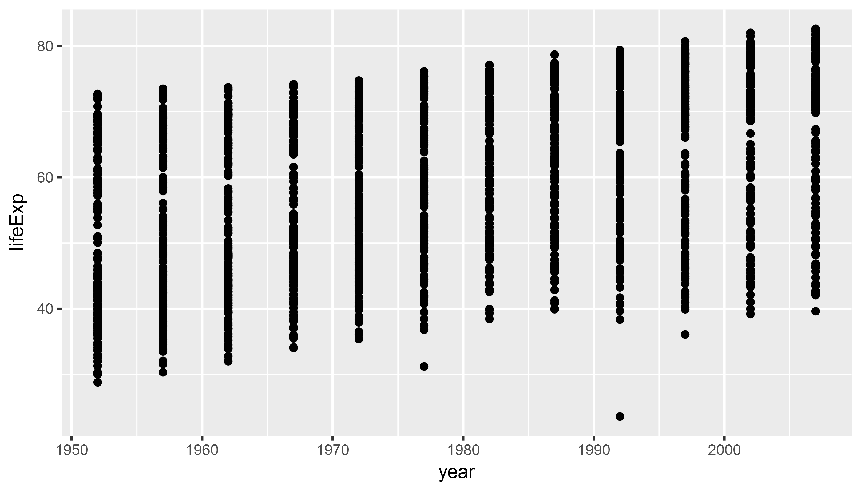
Aesthetics - Size
library(gapminder)
library(tidyverse)

example_plot <- ggplot(data = gapminder,
                       aes(x = year,  # the aes() function defines aesthetics
                           y = lifeExp,
                           size = gdpPercap)) + # map the aesthetic 'size' to gdp/pc
  geom_point()

# print(example_plot)
Aesthetics - Size
print(example_plot)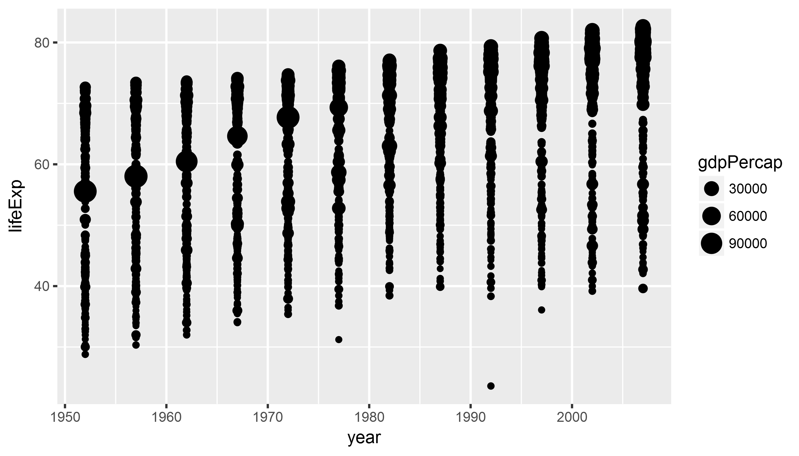
Aesthetics II - Color
library(gapminder)
library(tidyverse)

example_plot <- ggplot(data = gapminder,
                       # the aes() function defines aesthetics
                       aes(x = year,  # x axis
                           y = lifeExp, # y axis
                           color = continent, # map color to continent
                           size = gdpPercap)) + # map the aesthetic 'size' to gdp/pc
  geom_point()
Aesthetics II - Color
print(example_plot)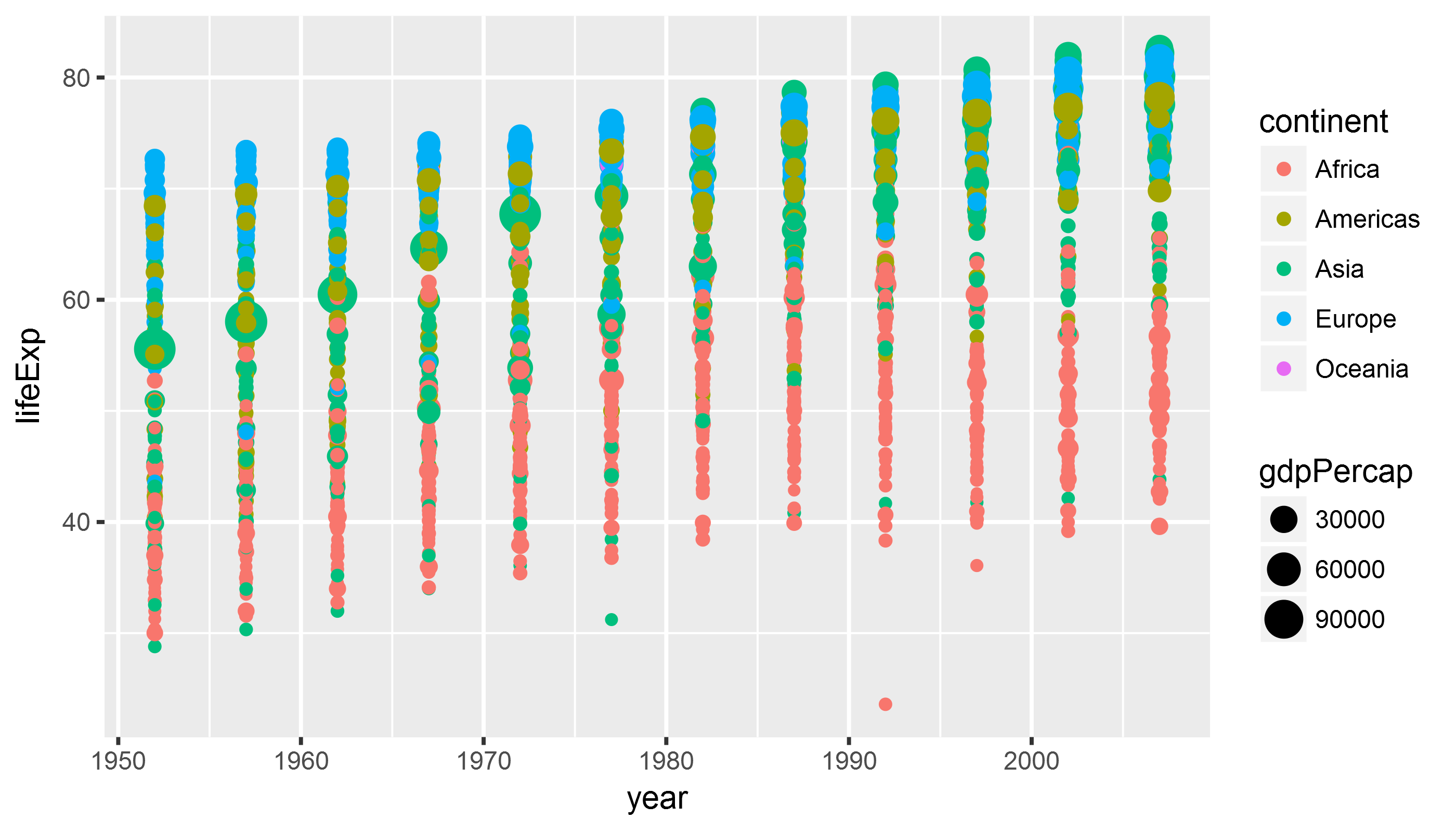
class: inverse background-image: url(“Ninja-header.svg_opacity1.png”) background-size: contain
Useful tips from the dataviz ninja
Think hard about what you want to visualize!
Don’t use too many aesthetics - just use those that help you clarify your comparison! > “When ggplot successfully makes a plot but the result looks insane, the reason is almost always that something has gone wrong in the mapping between the data and aesthetics for the geom being used” - Kieran Healy
geoms
library(gapminder)
library(tidyverse)

example_plot <- ggplot(data = gapminder,
                       aes(x = year,
                           y = lifeExp)) +
  geom_line() # lines instead of points
geoms
Whoops! What happened here?
print(example_plot)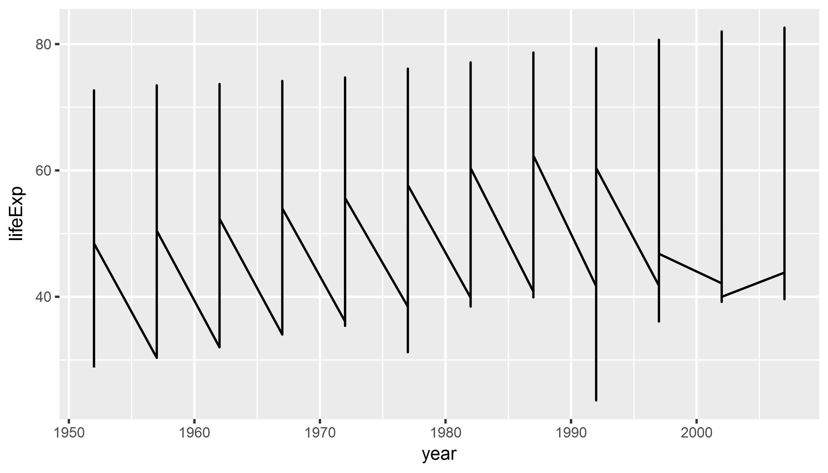
geoms
library(gapminder)
library(tidyverse)

example_plot <- ggplot(data = gapminder,
                       aes(x = year,
                           y = lifeExp,
                           group = country)) +  # tell ggplot2 which
                                                # observations belong together
  geom_line()
geoms
print(example_plot)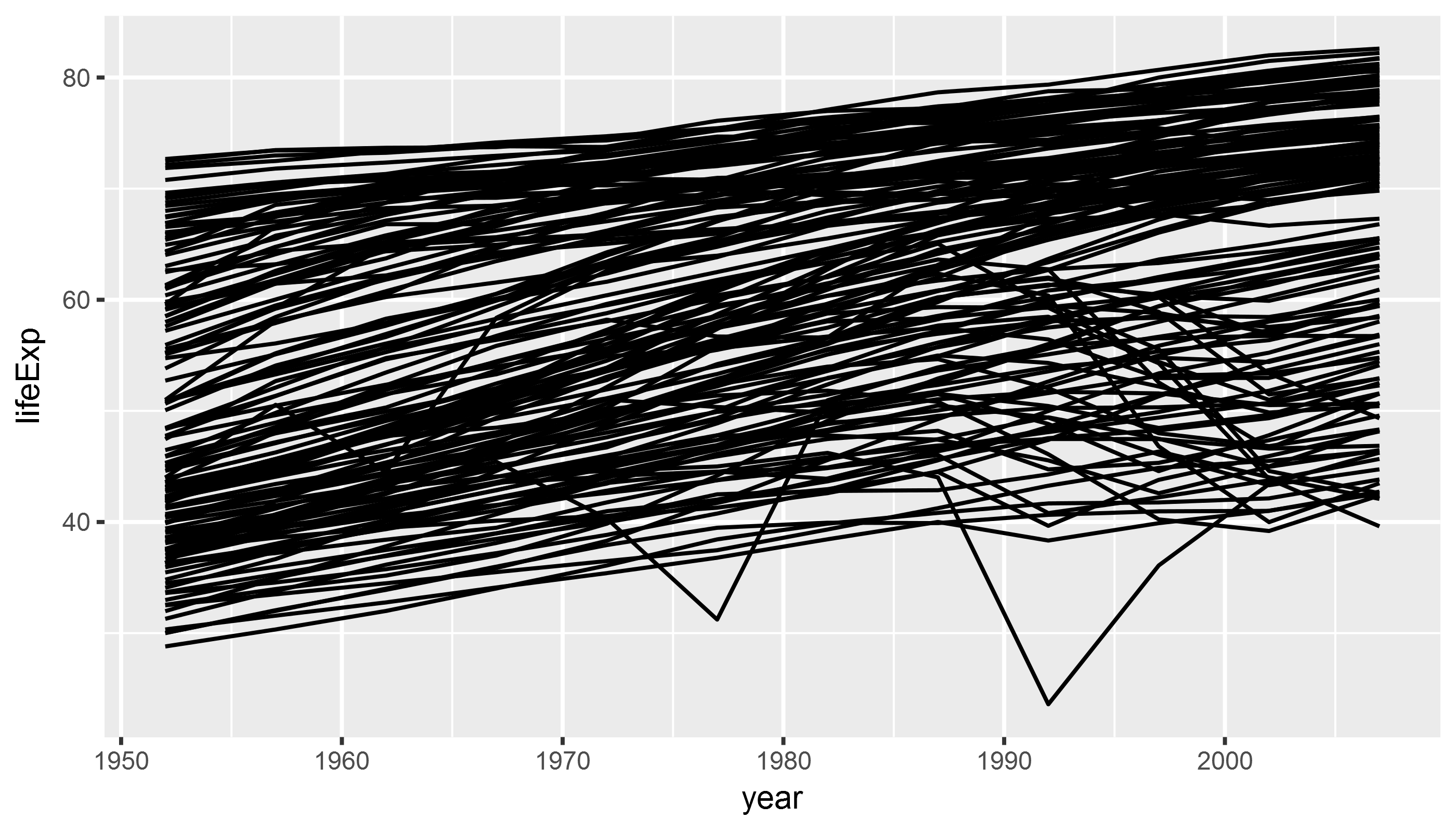
Combining geoms
library(gapminder)
library(tidyverse)

example_plot <- ggplot(data = gapminder,
                       aes(x = year,
                           y = lifeExp)) +
  geom_point() +
  geom_smooth(method = "lm") # add regression line
Combining geoms
print(example_plot)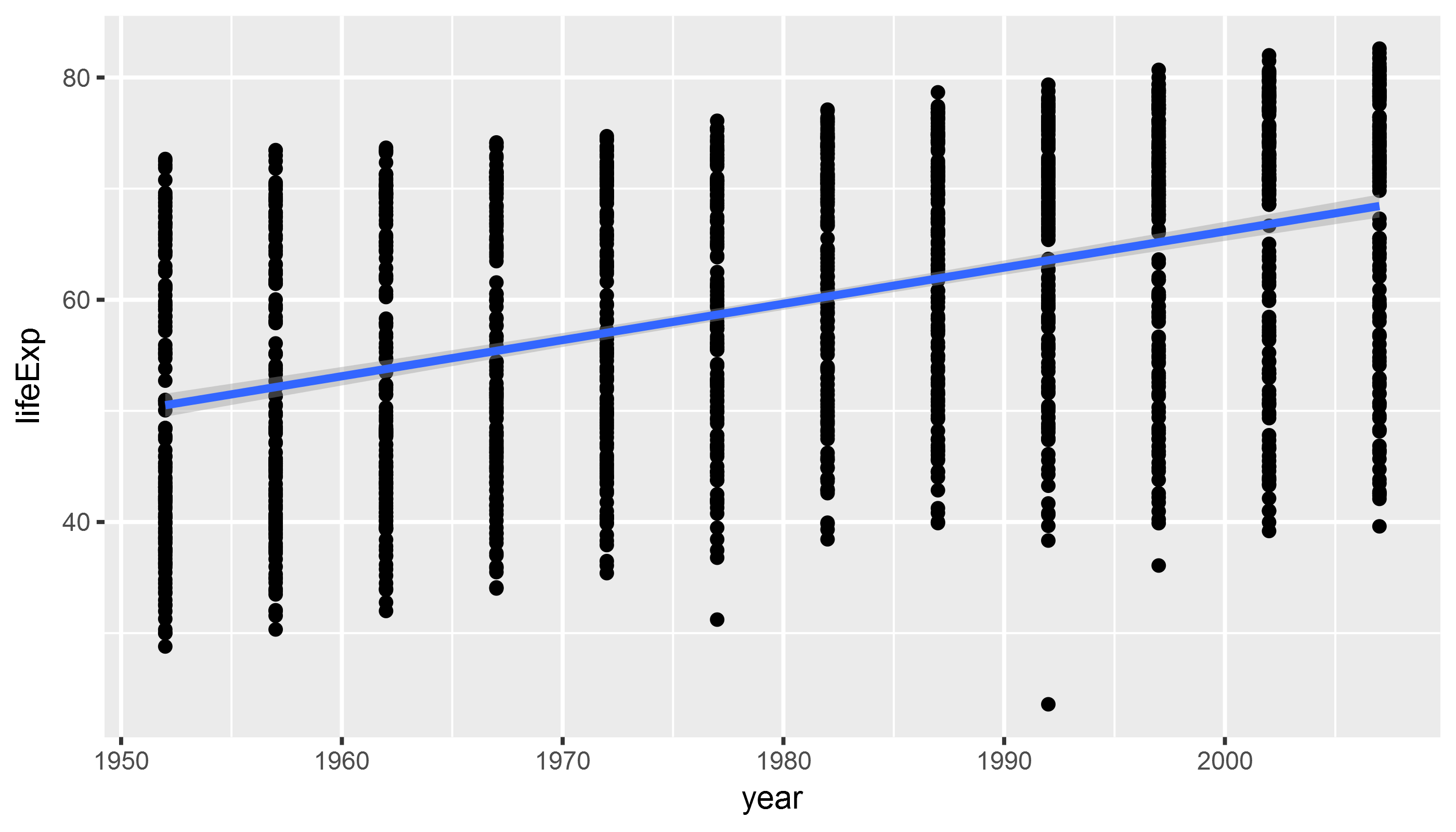
Combining geoms II
library(gapminder)
library(tidyverse)

example_plot <- ggplot(data = gapminder,
                       aes(x = year,
                           y = lifeExp)) +
  geom_point() +
  geom_smooth(method = "lm") +
  geom_smooth(method = "loess",
              color = "firebrick") # fix smoother color
Combining geoms II
print(example_plot)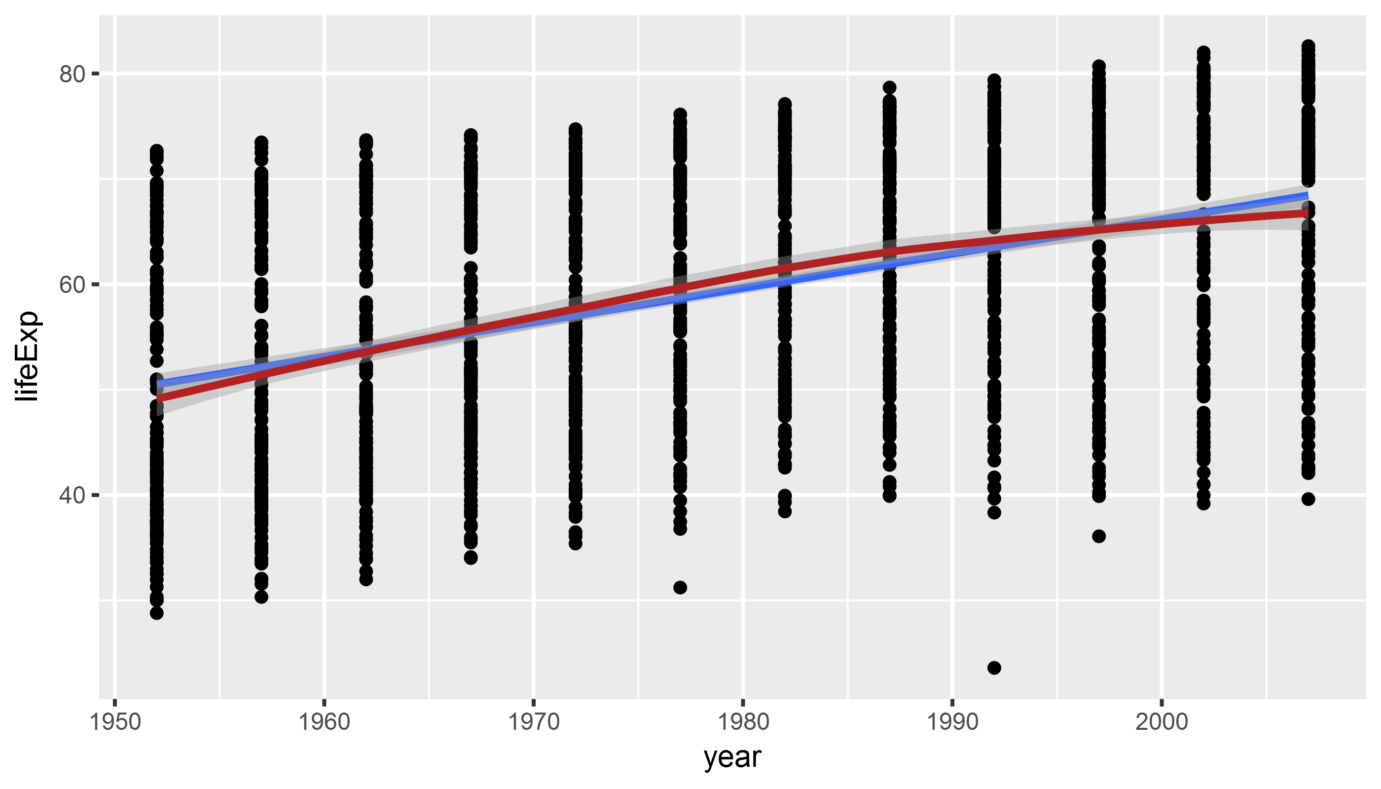
Short exercise
In the prior example we fix the color, i.e. we map it to a fixed value (firebrick which is red). What happens if we use the aes()function within the the geom_smooth() geom to map color to a variable in the gapminder dataset, such as continent?
Try out yourself!
Manipulate and Preprocess Data
Suppose we want to compare GDP/capita between North and South America visually.
We need to filter our data. Filtering helps to reduce complexity & get at the comparison that we want. To do that, we use the dplyr package which is part of the tidyverse.
To filter data, we use the filter() function which comes with the dplyr package.
library(tidyverse) # loads dplyr package, among others
library(gapminder)

gapminder_americas <- gapminder %>% # the %>% `chains` together functions
  filter(continent == "Americas") # that's two "="

head(gapminder_americas, 5)
## # A tibble: 5 x 6
## country continent year lifeExp pop gdpPercap
## <fctr> <fctr> <int> <dbl> <int> <dbl>
## 1 Argentina Americas 1952 62.5 17876956 5911
## 2 Argentina Americas 1957 64.4 19610538 6857
## 3 Argentina Americas 1962 65.1 21283783 7133
## 4 Argentina Americas 1967 65.6 22934225 8053
## 5 Argentina Americas 1972 67.1 24779799 9443Manipulate and Preprocess Data
Modify/add variables to existing data frame. We modify data with the mutate() function and chain them together using the pipe operator %>%.
library(tidyverse) # loads dplyr package, among others
library(gapminder)

gapminder_americas <- gapminder %>%
  filter(continent == "Americas") %>%
  # create a character/categorical variable
  # to distinguish between North/South America
  mutate(north_america = ifelse(country == "United States" |
                                  country == "Canada",
                                "north_america",
                                "south_america"))
head(gapminder_americas,3)
## # A tibble: 3 x 7
## country continent year lifeExp pop gdpPercap north_america
## <fctr> <fctr> <int> <dbl> <int> <dbl> <chr>
## 1 Argentina Americas 1952 62.5 17876956 5911 south_america
## 2 Argentina Americas 1957 64.4 19610538 6857 south_america
## 3 Argentina Americas 1962 65.1 21283783 7133 south_americaManipulate and Preprocess Data
Use filtered and preprocessed data to highlight comparisons in ggplot:
ggplot(gapminder_americas, # only use data for Americas
       aes(x = year,
           y = gdpPercap,
           color = north_america)) + # map "north_america" category to color
  geom_point()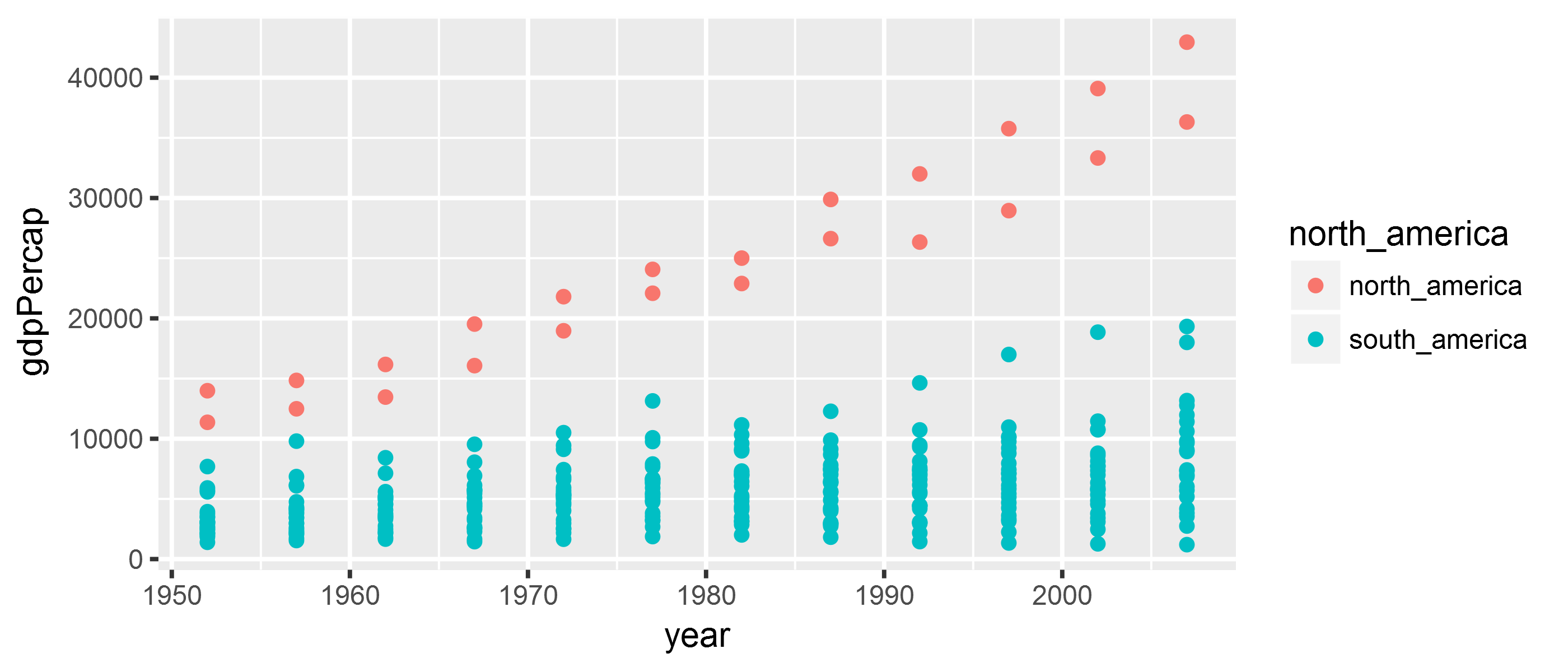
Exercise
Plot the development of population size (pop variable in the gapminder data) over time (year variable in the gapminder data) in Asia (hint: continent == "Asia"). Add a trend line and/or smooth line.
Bonus exercise: Plot the relationship between population size pop and gdpPercap! (hint: might make sense to wrap pop and gdpPercap in log()).
Solution
library(tidyverse)
library(gapminder)

gapminder_asia <- gapminder %>%
  filter(continent == "Asia")

asia_pop <- ggplot(gapminder_asia,
                   aes(x = year, y = pop)) +
  geom_point() +
  geom_smooth(method = "lm")

print(asia_pop)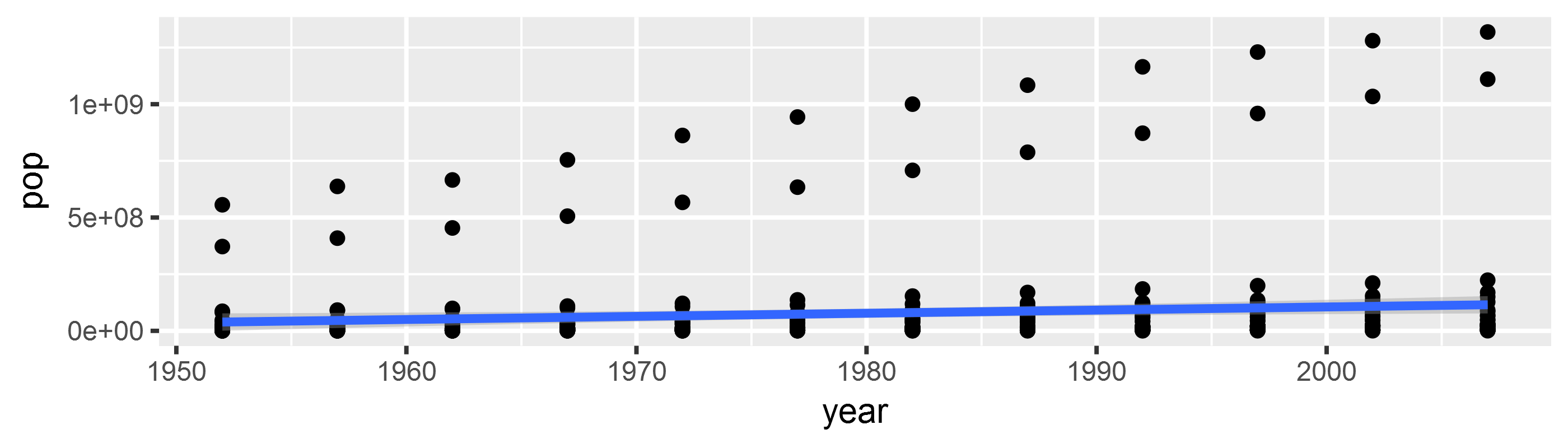
Walkthrough Exercise
Goal:
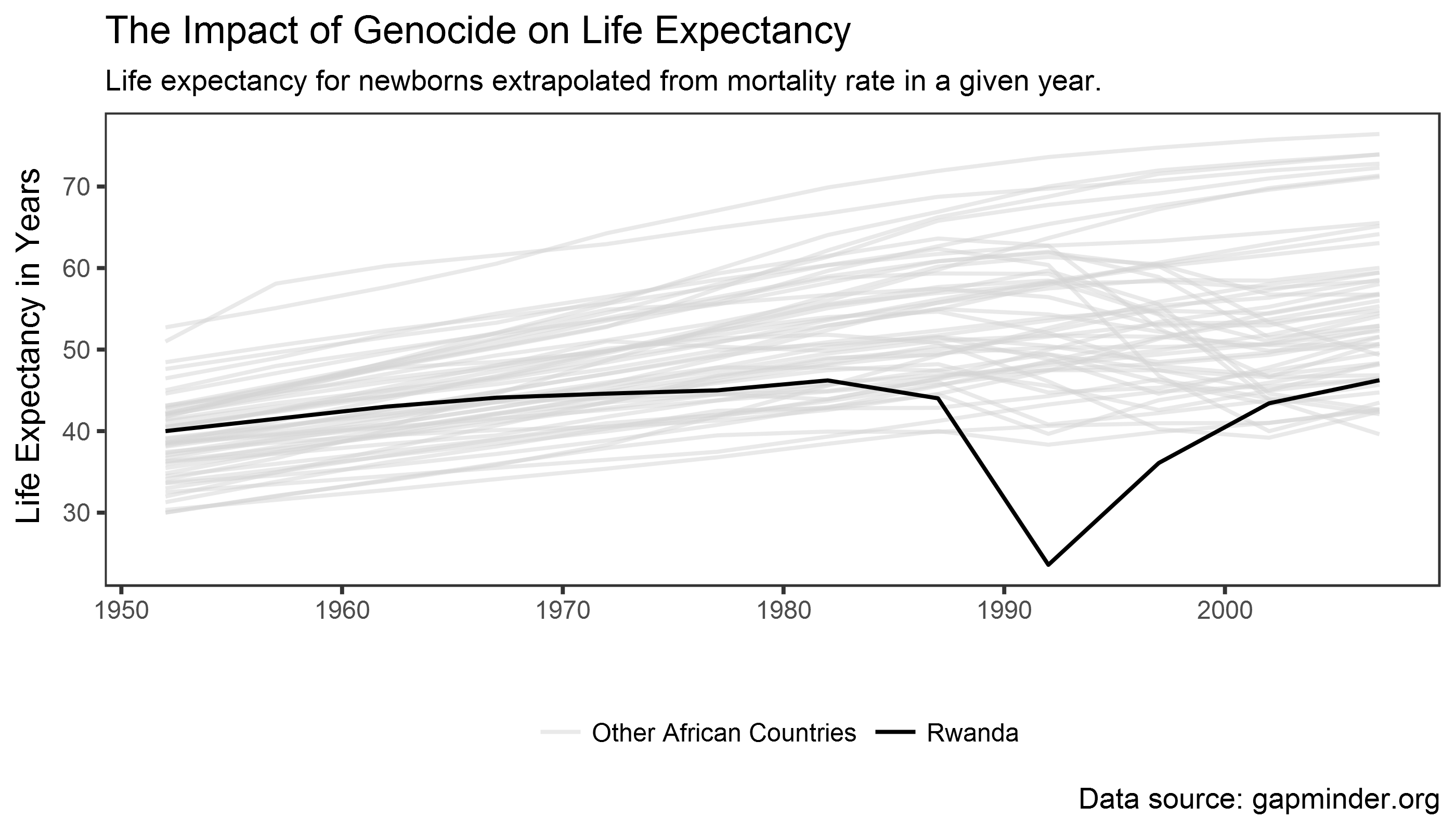
What do we want to visualize?
Think about the data! What is the comparison?
Genocide vs. non-genocide countries => Rwanda vs. rest of Africa
library(gapminder)
library(tidyverse)

gapminder_africa <- gapminder %>%
  # filter only African countries
  filter(continent == "Africa") %>%
  # create a categorical variable that distinguishes
  # between Rwanda and other African countries
  mutate(color_plot = ifelse(country != "Rwanda", # != = "!" + "="
                             "Other African Countries",
                             "Rwanda"))
Add geom_line() + map color/alpha
rwanda_plot <- ggplot(gapminder_africa,
                      aes(x = year,
                          y = lifeExp,
                          group = country,
                          color = color_plot)) +
  geom_line(aes(alpha = color_plot)) # map alpha to "color_plot" variable
                                     # ggplot chooses alpha level automatically


print(rwanda_plot)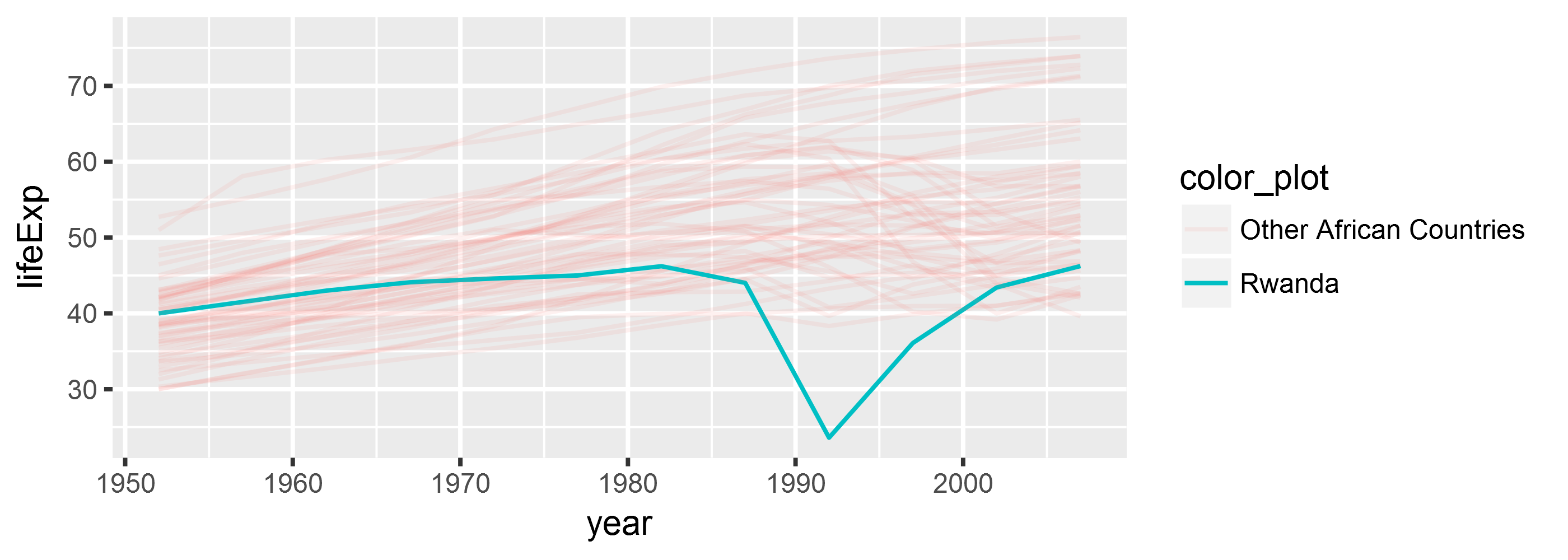
Add color/alpha scales
rwanda_plot <- ggplot(gapminder_africa,
                      aes(x = year,
                          y = lifeExp,
                          group = country,
                          color = color_plot)) +
  geom_line(aes(alpha = color_plot)) +

  # we assign colors/alpha values/other "aes" through "scale" functions
  scale_alpha_discrete("", range = c(0.5, 1)) +
  scale_color_manual("", values = c("lightgrey", "black"))


print(rwanda_plot)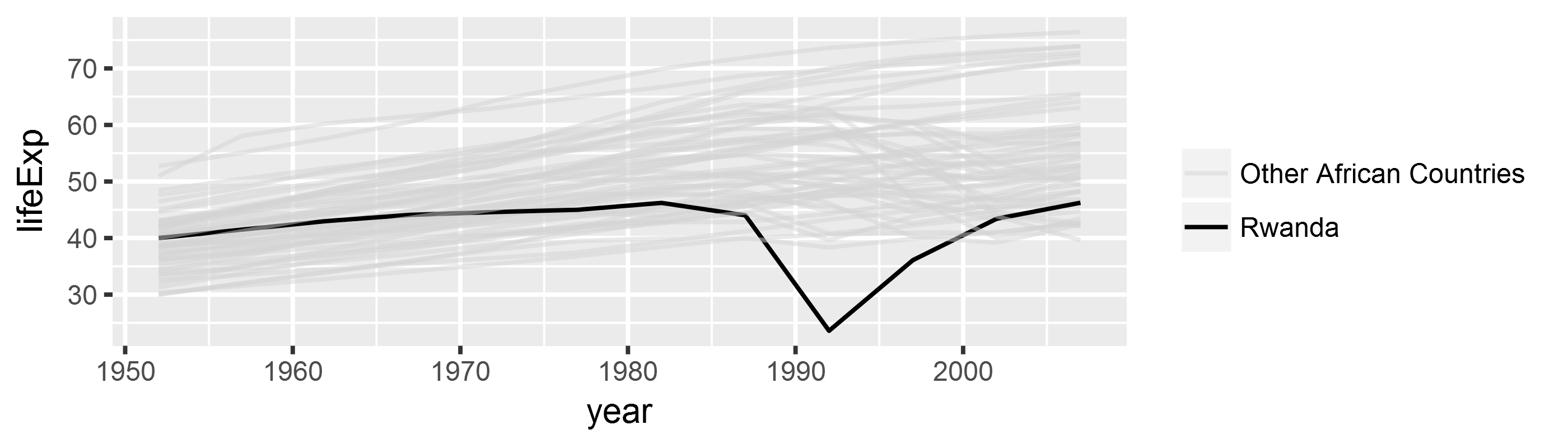
Manipulate appearance: add theme
rwanda_plot <- ggplot(gapminder_africa,
                      aes(x = year,
                          y = lifeExp,
                          group = country,
                          color = color_plot)) +
  geom_line(aes(alpha = color_plot)) +
  scale_alpha_discrete("", range = c(0.5, 1)) +
  scale_color_manual("", values = c("lightgrey", "black")) +

  # add theme
  theme_bw() + # black and white theme
  theme(legend.position = "bottom", # legend position
        panel.grid = element_blank()) # remove grid lines
Manipulate appearance: add theme
print(rwanda_plot)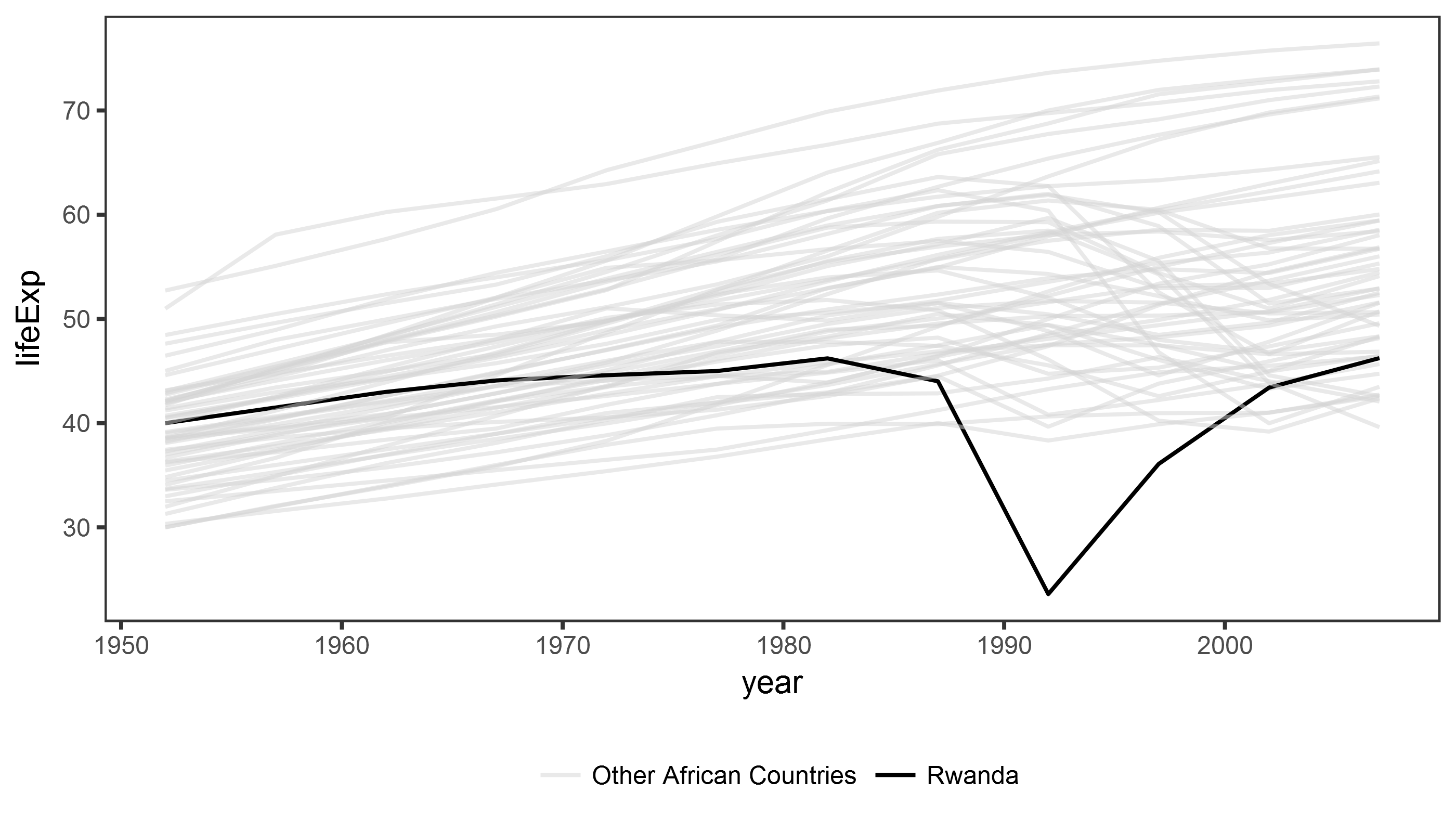
Manipulate appearance: change labels
rwanda_plot <- ggplot(gapminder_africa,
                      aes(x = year,
                          y = lifeExp,
                          group = country,
                          color = color_plot)) +
  geom_line(aes(alpha = color_plot)) +
  scale_alpha_discrete("", range = c(0.5, 1)) +
  scale_color_manual("", values = c("lightgrey", "black")) +
  theme_bw() +
  theme(legend.position = "bottom",
        panel.grid = element_blank()) +

  # labels, captions, and title/subtitle
  labs(x = "", y = "Life Expectancy in Years",
       title = "The Impact of Genocide on Life Expectancy",
       subtitle = "Life expectancy for newborns extrapolated from mortality rate in a given year.",
       caption = " Data source: gapminder.org")
Manipulate appearance: change labels
print(rwanda_plot)
class: inverse background-image: url(“Ninja-header.svg_opacity1.png”) background-size: contain
Useful tips from the dataviz ninja
Think hard about what you want to visualize!
Don’t use too many aesthetics - just use those that help you clarify your comparison!
Trial and error is your friend!
> “If you are unsure of what each piece of code does, take advantage of ggplot’s additive character. Working backwards from the bottom up, remove each + some_function(…) statement one at a time to see how the plot changes.” - Kieran Healy